8 Tested Tips to Improve eCommerce Conversion Rates [+ Examples]

Whether you are an industry veteran with a successful eCommerce site or you’re just looking to become one, it’s only natural to think that conversion rate optimization is a set-it-and-forget-it kind of process. It’s not.
Your online business is never static, and, just like a sports car, it needs fuel to drive faster and get you to the destination safely and comfortably. The fuel is your conversion rate optimization strategy, the destination—more revenue.
And if the end goal is, in most cases, pretty much alike for all eCommerce companies, it doesn’t mean any strategy should be a good fit for your business.
Let’s take a look into some of the most effective ways to improve conversion rates that push you beyond the average 4% conversion rate bucket. Your homework would be to figure out which marketing strategy will actually turn your lookers into bookers, visitors into form-fillers, blog readers into newsletter subscribers, and one-time shoppers into returning buyers.
OK. Enough talk. Ready to turn your online store into a well-oiled, conversion generation machine? Then, hurry up, the adventures are waiting for us!
What Is an Online Conversion Rate?
Conversion rate is defined as the number of people who completed the desired action (e.g., purchased your item, subscribed to your email list, downloaded a PDF, etc.) divided by the total number of your store’s visitors.
Simply put, it’s a percentage of your website visitors who actually bought something from you.
How Do You Calculate an eCommerce Conversion Rate?
Calculating the eCommerce conversion rate for your online store is easier than you think.
The common conversion rate formula for an eCommerce store is:
Conversion rate = (Total number of unique visitors / Total number of sales)
If you are looking to count conversions for your email campaign, then the formula is going to be as follows:
Conversion rate = (Total number of clicks / Total number of sales)
If your goal is to identify how many qualified prospects developed a more personal relationship with you and made it official, here’s the best way to measure your success:
Conversion rate = (Total number of demo requests / Total number of sales)
For example, if you score somewhere around 200 sales a month with 20K visitors landing on your website, your conversion rate would be 1%, which is rather low.
According to Invesp, the average conversion rate for the US eCommerce websites is 2.86%, which is also quite low compared to the global conversion rate of 4.31%.
I already hear you sighing. Is that all an average eCommerce retailer can hope for? Is it at all possible to make your store perform exponentially better than others?
And the answer is yes. Your conversion rate may be a lot higher than you may expect.
Though, in general, conversion rates vary from 2% to 4%, some industries reach higher conversion rates.
For instance, FireClick Index data shows that average conversions for fashion and apparel retailers goes up to 6.10% for first-time visitors.
Below you can see conversions for specialty websites, which vary from 7% to almost 9%:

Source: FireClick Index
There’s more. According to Business2Community, conversions on freemium products (e.g., Slack or Spotify) can be as high as 30%.
Wait, What Are the Typical Conversions for eCommerce Businesses?
Making a purchase is the biggest conversion metric for any business. However, it doesn’t have to be the only metric that you should be tracking.
Based on your objectives, a ‘conversion’ could be anything: from sharing content in social media to upgrading a free trial to a paid plan. Below are a few more examples:
- Adding an item to a wishlist or shopping cart.
- Signing up for an email newsletter.
- Filling just about any form you have on your website.
- Applying a promo code.
- Reaching out to a sales rep.
- Requesting a demo.
- Any other KPI valuable for your business niche.
By setting multiple touchpoints, you can track how your website visitors progress towards making a purchase. Then, you can differentiate those coming to your site for freebies from those who are willing to spend $$ with you. You are aiming for the latter cohort, aren’t you?
Why Do You Need to Optimize Your Conversion Rates?
Conversion rate optimization (CRO) is important because it allows you to increase your average revenue per user (ARPU) while keeping your lead generation budget as low as possible.
Suppose your eCommerce website already generates 20K visitors a month. In that case, with a conversion rate of 4%, you have 800 conversions per month.
Moving right along. If your average order value (AOV) is $15, it means you make $12,000 monthly. And, even if it’s a tidy little sum for you, who wouldn’t want more of that, right? Having too much is never enough.
What if you could slightly increase your conversion rates? Let’s say, from 4% to 7% or even higher. Ideally, you want to break into the top 10% of the unicorns with conversion rates of 11.45%. Then, you’ll be able to triple your conversions, thus boosting your monthly revenue by 65% to $34,350 a month.
If this is your case, the right thing for you to do would be to stop increasing your advertising budgets and finally tap into CRO.
Where do you start? Read on to find it out.
8 Strategies That Should Help You Level up Your Conversions
The following conversion optimization strategies are already actively used by many eCommerce businesses and will be used even more, as, with COVID-19 restrictions in place, online shopping is only gaining momentum.
Tip #1: Identify User Intent to Boost Conversions
The starting point of successful conversion optimization should be determining your users’ intent.
Answering the following questions should give you a better understanding of what your buyer personas are and what intentions they have:
- What do your potential customers feel when they see your site in search engines? Are they willing to click on the link?
- What are they going to do first thing after they land on your website for the first time?
- How happy are they likely to be with the content you provide?
- Do they bounce immediately or hang out on your product page for some time before they exit?
- Does that huge purple button at the very bottom of your homepage appeal to them?
Google Analytics can provide you with all the necessary data you need to understand your user’s behavior. However, without a consistent approach, your conversion performance will be murky or impossible to conceive.
Luckily, there is a wealth of digital marketing techniques that can ease the process. According to Jeremy Smith, there are three fundamental components of conversion rate optimization that form the so-called Conversion Triangle:
- Relevance. Your site visitors should immediately feel at home, regardless of the traffic source. Your message and call-to-actions should be relevant to their needs and desires.
- Motivation. There should be some triggers that will nudge website visitors down the sales funnel and ultimately get them to click ‘Buy.’
- Value proposition. People should clearly see why buying from you (not from a competitor’s website) is the best option.
And though each component of the Conversion Triangle can be implemented separately, I suggest that you should use them all in concert to ensure better conversion rates.
Tip #2: Provide Positive Emotions to Boost Long-Term Conversions
Joy. Isn’t that what everyone is looking for at the end of the day?
Even if your target audience are gloomy lawyers or (God forbid!) mortuary affairs specialists, you wouldn’t want them to stress out even more on checkout, and you shouldn’t.
Your tone of voice represents your brand’s personality and influences how your target audience perceives your messaging. People who feel happy throughout the checkout process are twice as likely to make a repeat purchase as people who had a negative or even neutral experience during checkout.
That said, here are a few recommendations on how to level up conversion rates creating a positive aura around your brand:
- Take time to connect with your customers on a personal level. They will deeply appreciate it.
- Arouse feelings and develop an emotional connection with your buyers.
- Walk in your customer’s shoes—this will help you understand what emotions they experience along the way.
- Do not underestimate the value of humor on social media and other channels.
Examples? The dudes from Slack have mastered the art of being funny on Twitter.
Whistling while you work: Do or don’t?
— Slack (@SlackHQ) December 11, 2020
…even when they share some no-nonsense company updates, with all the seriousness they deserve.
Somehow, someway, 12 months have passed, and we wanted to take a moment to acknowledge all the momentous moments of the past year… in a Twitter moment. ? https://t.co/iyIxhAwdED
— Slack (@SlackHQ) December 31, 2020
Today’s eCommerce world is always evolving, but a positive user experience is the one constant. It never goes out of fashion and motivates users to complete their purchases, thus increasing your store’s conversion rate.
Tip #3. Study Color Psychology
Do you know that colors can make people want to buy?
Just like the mood makes us think of certain colors, colors can affect our mood and intentions.
The table can give you an idea of how different colors can influence consumer behavior.
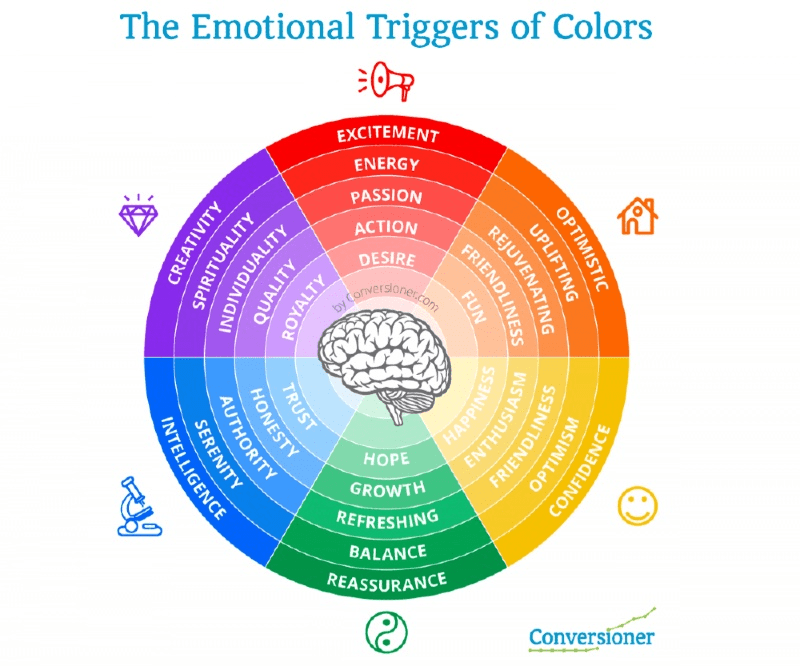
Source: Conversioner

A combination of warm colors, yellowish red and reddish-yellow, is appealing to impulse buyers looking for a bargain.

Cool colors create a feeling of trust and, thus, can attract relaxed but price-conscious customers who don’t mind spending some time hunting for the best deals online.

Green evokes the feeling of serenity and reminds customers of plants. This is just the right color for some health-oriented products such as energy-saving air conditioners or reusable water bottles. Yeah, health-nuts are an important customer segment, and you can capitalize on them.

Pinkish-purple, as well as magenta or lilac, would be a perfect choice if you are selling luxury goods. Pearls Only store, built with the X-Cart shopping platform, can be a great example of using purple color to sell items associated with royalty.

Use black, green, and blue to make people feel more at ease in this insecure world.
A simple change of a button color can result in increased conversions. The earlier you start incorporating color psychology, the higher chances you have of making the sale.
Tip #4: Tap Into Visual Cues
Now that you know which color resonates with your audience, I suggest that you step back and take a big-picture view of the project.
What do you feel about your store’s design as a whole?
Is there enough room to breathe?
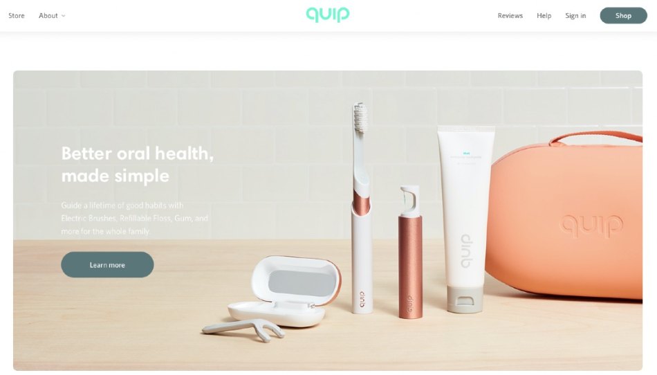
If the answer is ‘no,’ you may want to balance design elements adding some more white space. This should clear away distractions from your CTA.
Below you can see how Quip implements the theory of whitespace.
Do you play it right with fonts?
Fashion stores often play around with colors, but very few of us understand the role of fonts and typography in eCommerce.
A simple change of font and line spacing can reduce bounce rates, boost page visits, and increase conversion rates.
Do you use human eye gaze as a directional cue?
Without realizing it, people tend to direct their attention to what other people are focused on. That said, featuring a smiling person looking in the direction of your CTA button or lead form could be a great conversion optimization technique. Yep, that simple.

What about high-quality pictures and videos?
In today’s high-velocity retail world, you have no more than a few seconds to really hook in users. Therefore, videos and detailed pictures of your products could be a great way to grab users’ attention.
Tip #5: Reduce Unwanted Friction to a Bare Minimum
Anything that disturbs users while they are interacting with your product can be called friction. Anything that pops up out of nowhere, redirects, or blocks your shopper’s screen is friction, too. Even lack of branding and social proofing can potentially create friction and hinder the way to checkout.
You may be offering the best product or service, but if there are more than five friction points, your website visitors may never convert.
To be more precise, users may experience friction in four ways:
- Information friction. Unexpected shipping costs on checkout or any other info that pushes your customers back.
- Complexity friction. Complicated categories structure, tricky sign-up process, and other elements that are patently devoid of clarity.
- Time friction. If your content takes ages to load, you are likely to lose sales.
- Visual friction. Unreadable fonts, background music, and other disturbing elements.
Identify all the bottlenecks that get in the way of your shoppers’ user experience and ditch them, whatever it takes. It will increase conversion rates and revenue overall.
Tip #6: Deal With User’s Anxiety
Anxiety is basically about friction, isn’t it? This is only partially true.
Friction will always be part of the eCommerce process, and you’ll hardly be able to eliminate it. That’s the fact. Whereas anxiety is an underlying problem, and if you are looking to reduce friction, you should first find out what causes the user anxiety.
So what are the ways to reduce anxiety?
Educate users about your brand
The fear of the unknown is the most common (and probably the basic) feeling people experience shopping online.
They do not have a shopping assistant, and they can only guess about your store’s security. And, what’s most important, there’s no good way to touch the products you sell.
If any doubt or anxiety begins to creep into your shoppers’ minds—you can say good-bye to your conversions and hello to cart abandonment.
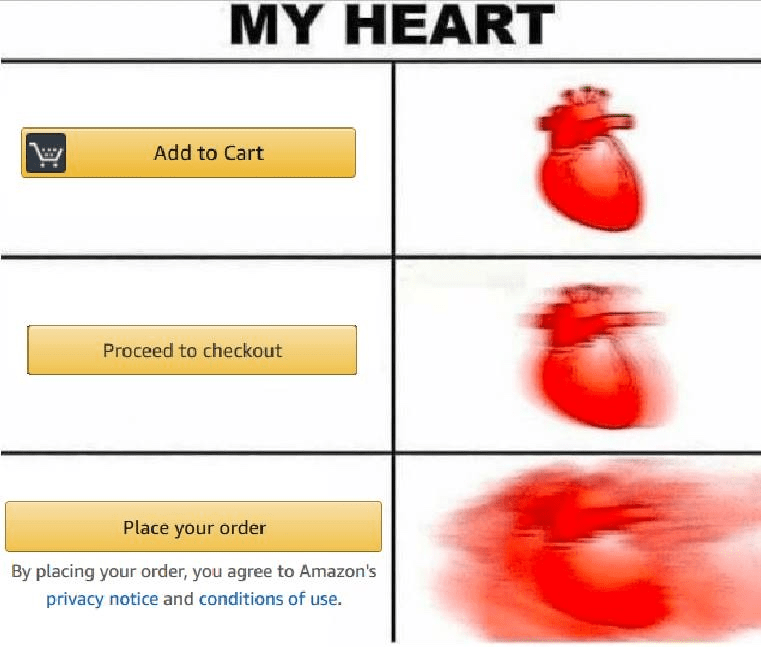
Educating your customers can help lower the anxiety levels. (Phew!)
For that to happen, be transparent about your pricing, explain the benefits of your products or services, dig into the details (but only a little bit). You may even try to compare your products with the competition.
Maintain brand consistency across all platforms
Having a logo, images, and ads that generally look the same means you achieved consistency across all channels. Showing up regularly on each of the channels and having a consistent message can also help you maintain consistency and reduce anxiety.
Create an aura of safety
Having links to your returns policy, privacy policy, and all sorts of “Terms” and “Conditions” within easy reach of the checkout screen can release the anxiety and, thus, boost conversion rates.
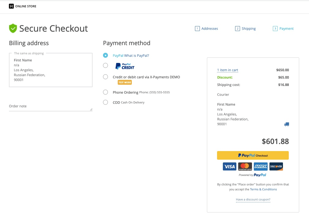
Giving your website visitors an option to ask questions can also help reduce pressure.
Tip #7: Run A/B Tests on a Regular Basis
It may sound quite obvious, but still, A/B testing should be at the forefront of conversion rate optimization. Its hardest part is to pinpoint what to test. Below are a couple of principles that make the testing process more coherent:
- Identify the friction keeping your potential customers from converting and remove it by changing the flow—test different variations of the flow before pushing out the changes.
- It’s important to have a well-formed hypothesis and keep it in mind throughout the testing process.
- Small changes can sometimes be more impactful than the major ones. If you are unsure of where to start, just take a deep breath and read on. We’ve got a couple of solutions for you.
I won’t elaborate on this any further as there’s a definitive guide on A/B testing published just a couple of months ago. Refer to it to discover some of the best testing tools, metrics, strategies, and other things that may come in handy when optimizing your store for conversions.
Having your eCommerce site set up with X-Cart, you have a clear advantage over your competition as the shopping platform allows you to customize your storefront the way you feel like. More options for customization means more opportunities for A/B testing.
Tip #8: Fix the Technical Side of Things
Website performance is another thing you should be focusing on when improving your conversion rates.
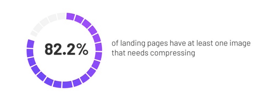
According to Unbounce, 82.2% of the landing pages have at least one oversized image, which can lead to increased bounce rates and fewer conversions.
Does your site load fast on mobile devices? What about tablets?
Using the tools such as WebPageTest can help you determine the performance potential of your site, fix it if needed, and thus improve your mobile conversions.
One more thing that is worth mentioning is stability. All the forms that your potential customers have to sign up for to make a purchase, as well as your search and checkout functionality, have to be properly fine-tuned and provide a seamless user experience.
No one will want to jump on the digital shopping bandwagon if the wagon is broken.
Bottomline
If you already spent a fair bit of your time optimizing your store for conversions but had very little luck converting those leads into life-long customers, we’ve got you covered.
By implementing all the strategies mentioned above, you’ll soon find yourself among those top 10% of the unicorns that are already killing the competition.
If not, don’t feel bad about it, our solution advisors are here to have your back.
What conversion rate optimization techniques do you already use? Feel free to share them in the comments section below.

Helen is an SEO and Content Marketing Specialist. She has been creating and planning content for over 10 years, with 5+ years specializing in eCommerce.
